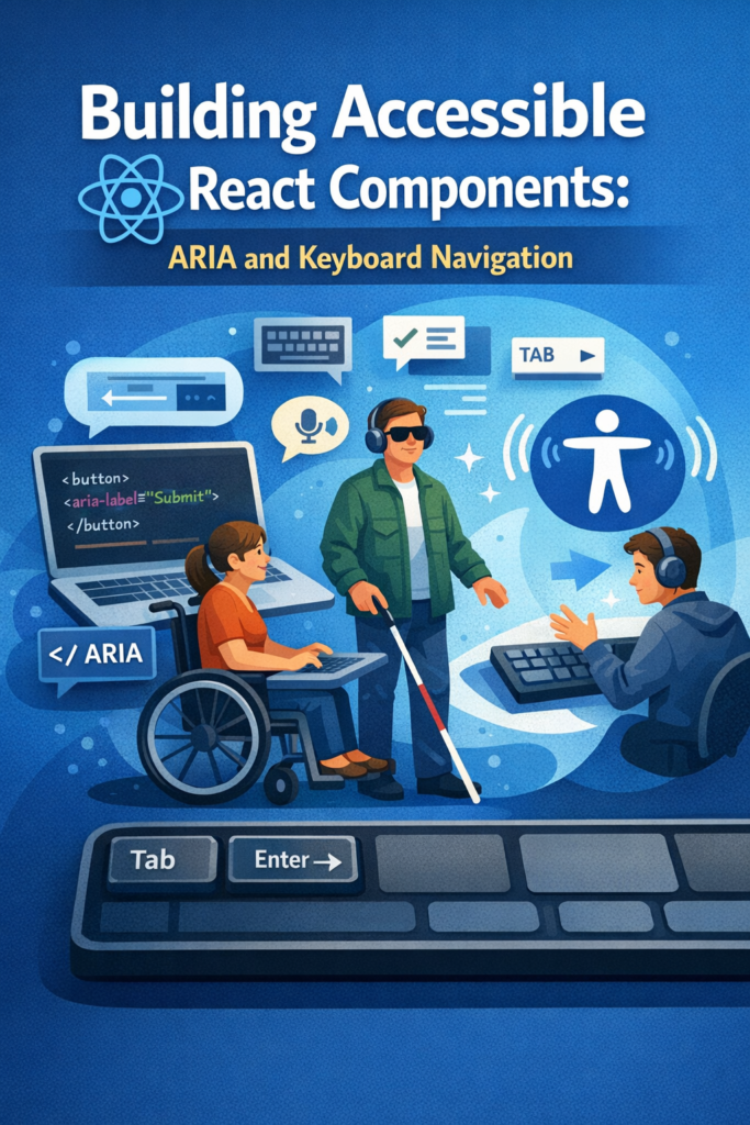
Accessibility is a core part of building high-quality React applications. Modern UIs must work not only with a mouse, but also with keyboards, screen readers, and assistive technologies. When accessibility is ignored, even visually polished apps become difficult or impossible to use.
This guide shows how to build accessible React components by combining:
- Semantic HTML
- ARIA roles and attributes
- Keyboard navigation
- Predictable focus management
The goal is practical accessibility that improves UX for everyone, not just edge cases.
Accessibility Is About More Than Vision
Accessibility does not focus only on users who cannot see. It also supports:
- Keyboard-only users
- Users with motor impairments
- Users with temporary limitations (injury, broken mouse)
- Power users who rely on shortcuts
In complex, interactive interfaces especially those that update frequently accessibility becomes even more important. Real-time UI patterns, like those described in WebSocket Real-Time Applications in React Native, must handle focus and announcements carefully to avoid disorienting users.
Start with Semantic HTML
The strongest accessibility feature in React is native HTML. Before adding ARIA, always check whether a semantic element already solves the problem.
Native elements provide:
- Keyboard support
- Screen reader labels
- Expected interaction behavior
Prefer Native Elements
<button onClick={handleSubmit}>
  Submit
</button>
Avoid Replacing Semantics
<div onClick={handleSubmit}>
  Submit
</div>
Using the correct element reduces the need for ARIA and prevents subtle accessibility bugs.
Understanding ARIA in React
ARIA (Accessible Rich Internet Applications) adds meaning when native semantics are not enough. It should enhance, not replace, semantic HTML.
Common ARIA attributes include:
aria-labelaria-expandedaria-selectedaria-liverole
React supports ARIA attributes directly as props.
Accessible Icon Button Example
<button aria-label="Close modal">
  ✕
</button>
Without an accessible name, screen readers would announce this button ambiguously.
For deeper guidance, the official WAI-ARIA Authoring Practices provide detailed, authoritative patterns for building accessible components.
Keyboard Navigation Is Mandatory
Every interactive element must be usable with a keyboard. This includes:
- Buttons
- Links
- Menus
- Custom components
Key principles:
- All interactive elements must be focusable
- Focus order should match visual order
- Keyboard behavior must mirror mouse behavior
Handling Keyboard Events
function SelectableItem({ onSelect }) {
  return (
    <div
      role="button"
      tabIndex={0}
      onClick={onSelect}
      onKeyDown={(e) => {
        if (e.key === "Enter" || e.key === " ") {
          onSelect();
        }
      }}
    >
      Select item
    </div>
  );
}
This ensures both mouse and keyboard users can interact with the component.
Focus Management in Dynamic Components
Focus management becomes critical in components that appear or disappear dynamically:
- Modals
- Dropdowns
- Side panels
- Notifications
When focus jumps unpredictably, users lose context.
Managing Focus with useRef
import { useEffect, useRef } from "react";

function Modal({ isOpen }) {
  const confirmRef = useRef<HTMLButtonElement>(null);

  useEffect(() => {
    if (isOpen) {
      confirmRef.current?.focus();
    }
  }, [isOpen]);

  return <button ref={confirmRef}>Confirm</button>;
}
This pattern keeps navigation predictable and controlled.
Common ARIA Roles in UI Components
Dialogs
<div role="dialog" aria-modal="true" aria-labelledby="dialog-title">
Menus
<ul role="menu">
  <li role="menuitem" tabIndex={0}>Edit</li>
</ul>
Tabs
<button role="tab" aria-selected="true">
Use roles only when native elements do not already provide the same semantics.
Accessibility in Forms
Forms are a common source of accessibility issues:
- Inputs without labels
- Errors not announced to screen readers
- Validation feedback that relies only on color
When building forms, always:
- Associate labels with inputs
- Announce validation errors
- Preserve keyboard navigation
These practices integrate well with structured form logic like the one shown in Building Forms in React with React Hook Form and Zod Validation.
Announcing Dynamic Content
When content updates dynamically, screen readers may not detect the change.
Live regions help announce updates:
<div aria-live="polite">
  {statusMessage}
</div>
This technique works well for:
- Inline validation messages
- Status notifications
- Live system updates
Event-driven systems that rely on background updates, such as those discussed in Redis Pub/Sub for Real-Time Applications, should always consider how updates are announced.
Testing Accessibility
Accessibility should be tested continuously.
Recommended approaches:
- Keyboard-only navigation testing
- Screen reader testing (VoiceOver, NVDA)
- Automated audits with tools like Lighthouse or axe
For authoritative guidance, the Web Content Accessibility Guidelines (WCAG) define the global standard for web accessibility.
Accessibility as a Design Constraint
When treated as a design constraint rather than an afterthought, accessibility improves both UX and code quality.
As a result, components become simpler, interactions more predictable, and layouts easier to reason about. This mindset mirrors broader engineering principles, such as designing systems that fail gracefully and remain usable under constraints.
Common Accessibility Mistakes
Avoid these frequent issues:
- Using non-semantic elements for interaction
- Removing focus outlines without alternatives
- Relying on color alone to convey meaning
- Adding ARIA attributes unnecessarily
In accessibility, less is often more.
Conclusion
Building accessible React components is not about adding complexity. Instead, it is about making intentional choices that respect how users interact with interfaces.
By:
- Preferring semantic HTML
- Using ARIA carefully
- Supporting keyboard navigation
- Managing focus predictably
You create React applications that are more usable, more robust, and more professional.
Accessibility is not only for a subset of users, it is a quality bar for modern software.