Styling has always been one of the most debated topics in the React ecosystem. Over time, teams moved away from global CSS toward scoped styles, CSS-in-JS solutions, and, more recently, utility-first frameworks.
In 2026, the real question is no longer how to style a React component. Instead, teams ask which styling approach scales best as the codebase, team size, and UI complexity grow.
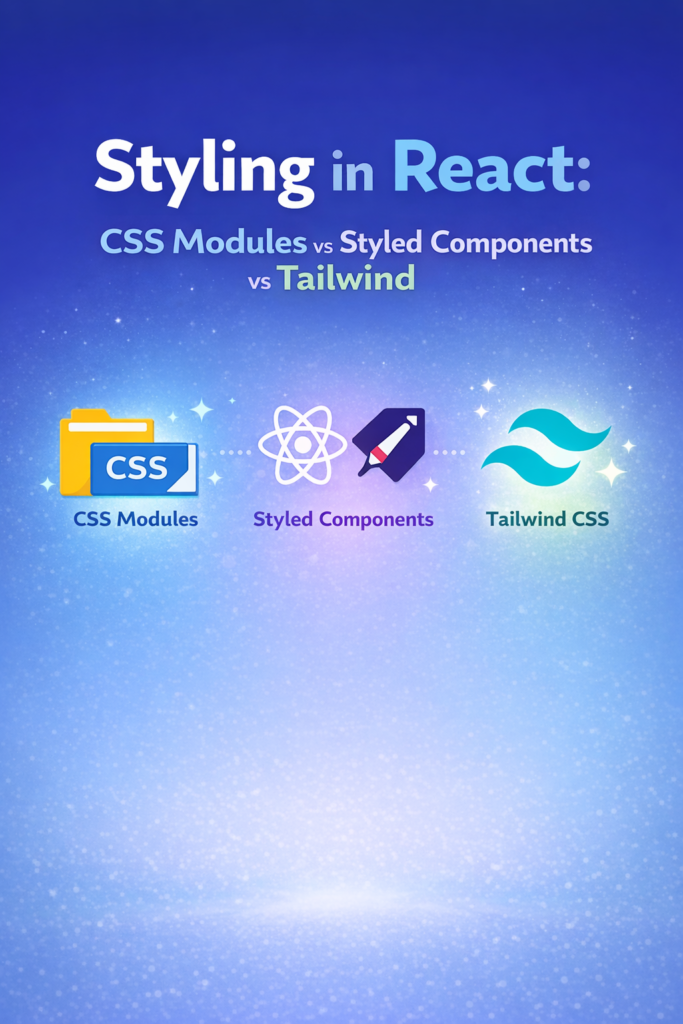
This guide compares CSS Modules, Styled Components, and Tailwind CSS using practical criteria: maintainability, performance, team workflow, and long-term scalability.
Why Styling Decisions Matter More Than You Think
Styling choices affect much more than visuals. They influence:
- Component isolation
- Build and runtime performance
- Refactoring safety
- Design consistency
- Developer velocity
When styling boundaries are unclear, UI bugs appear just as easily as logic bugs. This is similar to what happens when state boundaries are poorly defined, a topic explored in React Hooks Deep Dive.
For larger products especially dashboards and admin panels styling discipline becomes a core architectural concern, not a cosmetic one.
CSS Modules: Scoped CSS with Build-Time Safety
CSS Modules offer a simple idea: write regular CSS, but scope it locally by default. Each .module.css file generates unique class names during the build process.
Basic Example
/* Button.module.css */
.primary {
  background-color: #4f46e5;
  color: white;
  padding: 8px 12px;
}
import styles from "./Button.module.css";

export function Button() {
  return <button className={styles.primary}>Click</button>;
}
Why Teams Choose CSS Modules
CSS Modules work well because:
- Styles are scoped automatically
- There is no runtime styling cost
- Tooling stays simple
- Existing CSS knowledge transfers easily
As a result, CSS Modules are often used in structured UIs, including analytics-heavy layouts like those shown in Building a Dashboard with React, Recharts, and TanStack Table.
Where CSS Modules Fall Short
However, CSS Modules are not perfect:
- Conditional styling lives in JavaScript
- Variants can become repetitive
- Design systems need extra conventions
For highly dynamic components, these limitations become noticeable over time.
Styled Components: CSS-in-JS with Dynamic Power
Styled Components popularized the idea of colocating styles directly with components. Instead of separate CSS files, styles live inside JavaScript and respond to props and themes.
Basic Example
import styled from "styled-components";

const Button = styled.button`
  background-color: #4f46e5;
  color: white;
  padding: 8px 12px;
`;
Strengths of Styled Components
Styled Components shine when:
- Styles depend heavily on props
- Themes and variants are central
- Components behave like design primitives
- UI logic and styling are tightly coupled
This approach feels natural when building reusable component libraries or highly dynamic UI elements.
The Cost of Runtime Styling
Despite its flexibility, Styled Components introduce trade-offs:
- Styles are generated at runtime
- Bundle size increases
- Static analysis becomes harder
- Cold-start performance can suffer
For performance-sensitive screens—such as large tables or real-time dashboards—this overhead may conflict with optimization goals discussed in Building a Dashboard with React, Recharts, and TanStack Table.
Tailwind CSS: Utility-First and Constraint-Driven
Tailwind CSS takes a fundamentally different approach. Instead of writing custom CSS, you compose styles using predefined utility classes directly in JSX.
Basic Example
export function Button() {
  return (
    <button className="bg-indigo-600 text-white px-4 py-2 rounded">
      Click
    </button>
  );
}
Why Tailwind Scales Well
Tailwind has gained massive adoption because:
- Styles are static and tree-shaken
- There is zero runtime styling cost
- Design consistency is enforced
- Iteration speed is extremely high
Because of these traits, Tailwind works especially well in React and Next.js projects with fast-moving UI requirements. It also pairs naturally with modern build pipelines and component-driven development.
Addressing Common Criticism
At first glance, Tailwind can look verbose. However:
- Class grouping improves readability
- Design tokens reduce repetition
- Refactors become safer than global CSS edits
Once teams adopt shared conventions, JSX often becomes more predictable than scattered CSS files.
Performance Comparison
From a performance standpoint, the differences are clear.
CSS Modules resolve styles at build time, which means they add no runtime cost.
Similarly, Tailwind CSS generates static utilities and avoids runtime style injection.
By contrast, Styled Components incur runtime overhead because styles are evaluated and injected dynamically.
If performance is a priority especially for data-heavy views or real-time interfaces static styling approaches usually win.
Team Workflow and Scaling
Small Teams or Solo Developers
- Tailwind CSS for speed and consistency
- CSS Modules for simplicity
Medium to Large Teams
- Tailwind CSS with design tokens
- CSS Modules with strict conventions
Design-System–Heavy Products
- Tailwind CSS or carefully scoped Styled Components
- Avoid mixing multiple styling paradigms
The key lesson is consistency. The same principle applies to feature rollout and experimentation strategies described in Feature Flagging Using LaunchDarkly or Open-Source Alternatives.
Mixing Styling Approaches: A Common Pitfall
Many React codebases suffer because they mix:
- CSS Modules for some components
- Styled Components for others
- Tailwind utilities sprinkled inconsistently
As a result, onboarding slows down, duplication increases, and refactors become risky. Choosing one primary approach and enforcing it matters more than the specific library you pick.
When to Use Each Approach
Choose :
CSS Modules if:
- You want predictable, static styles
- Performance is critical
- Your team prefers traditional CSS
Styled Components if:
- Styling logic is highly dynamic
- Themes drive most UI decisions
- You accept runtime trade-offs intentionally
Tailwind CSS if:
- Speed and consistency matter
- You want strong design constraints
- Your app scales across many screens
Common Styling Mistakes
Avoid these patterns:
- Treating Tailwind as unstructured inline styles
- Using Styled Components everywhere without measuring cost
- Mixing global CSS with scoped systems
- Rebuilding design tokens repeatedly
Styling rewards discipline. The more intentional your constraints, the easier your UI becomes to maintain.
Conclusion
Styling in React has matured significantly. CSS Modules, Styled Components, and Tailwind CSS all solve real problems but for different contexts.
In 2026:
- CSS Modules remain a reliable default for predictable apps
- Styled Components fit niche, highly dynamic use cases
- Tailwind CSS excels in scalable, design-driven products
Ultimately, the best styling solution is the one your team can apply consistently, performantly, and confidently over the lifetime of the project.