Tailwind CSS has become a dominant styling solution for modern React and Next.js projects. Its utility-first approach enables fast development, consistent design, and predictable styling behavior. However, without clear conventions, Tailwind code can quickly become messy and hard to maintain.
This guide covers Tailwind CSS best practices that help you write clean, scalable styles in React and Next.js applications—without fighting your own CSS six months later.
Why Tailwind Works So Well with React and Next.js
Tailwind fits naturally into component-based development. Instead of juggling CSS files, naming conventions, and overrides, you style components directly where they live.
This approach aligns well with ideas discussed in Building a React App with Next.js 14, where co-locating logic, markup, and styles improves clarity and maintainability.
At the same time, Tailwind removes many classic CSS problems:
- Global style leakage
- Naming collisions
- Dead CSS left behind after refactors
The result is faster iteration with fewer surprises.
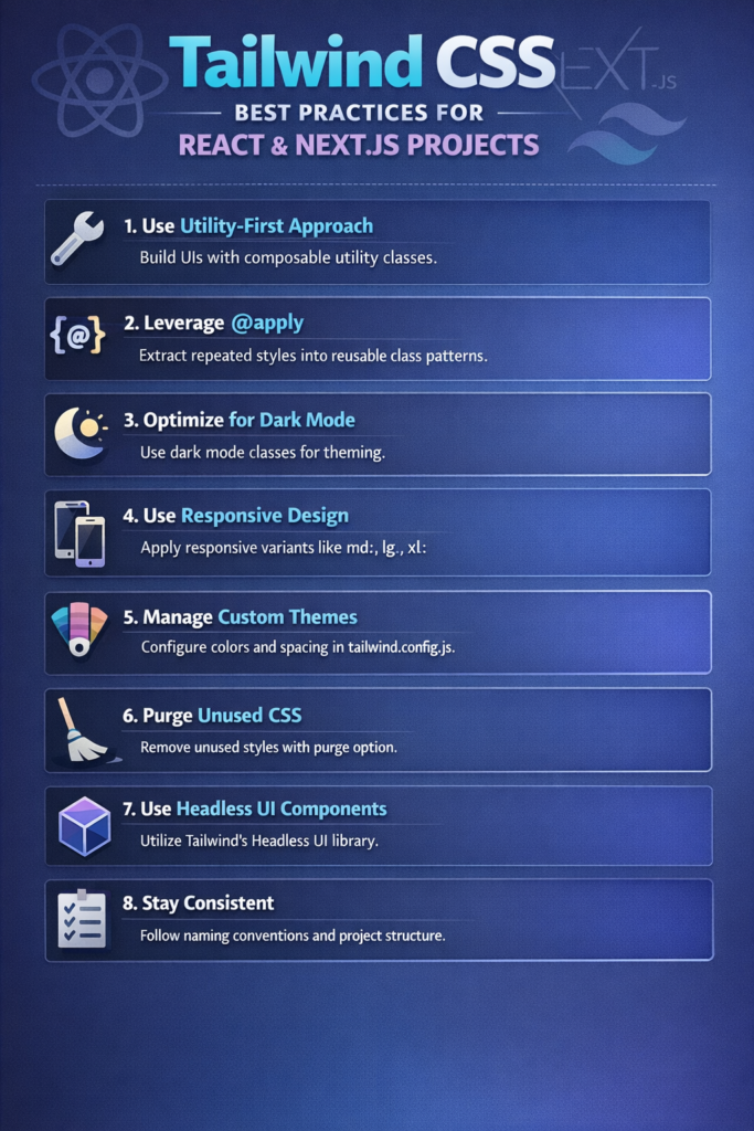
Use Utility Classes Intentionally
Tailwind’s biggest strength can also become its biggest weakness if misused.
Avoid Overloaded Class Strings
Long, unreadable class lists hurt maintainability:
<div className="flex items-center justify-between px-4 py-2 bg-white dark:bg-gray-900 border border-gray-200 rounded-lg shadow-sm">
Instead, extract intent-driven components when styles repeat.
function Card({ children }) {
  return (
    <div className="rounded-lg border border-gray-200 bg-white p-4 shadow-sm">
      {children}
    </div>
  );
}
This mirrors component reuse principles discussed in Building Reusable UI Components in React Native—even though the platform differs, the idea is the same.
Prefer Composition Over Abstraction
Tailwind encourages composition rather than heavy abstraction.
When to Create Components
Create a component when:
- The same utility set appears in multiple places
- The element represents a semantic concept (Button, Card, Badge)
- Changes should propagate consistently
Avoid creating components too early. Premature abstraction leads to rigid APIs that slow development.
Use clsx or classnames for Conditional Styles
Conditional styling is common in React. Instead of complex ternaries, use a helper.
import clsx from "clsx";

<button
  className={clsx(
    "rounded px-4 py-2 text-sm font-medium",
    isActive ? "bg-blue-600 text-white" : "bg-gray-100 text-gray-800"
  )}
>
  Save
</button>
This keeps your JSX readable and prevents logic-heavy class strings.
Organize Tailwind for Large Projects
As projects grow, structure becomes critical.
Recommended Folder Strategy
components/ui→ generic UI componentscomponents/features→ feature-specific componentsstyles→ Tailwind config, global styles
This approach pairs well with feature-based structures described in Feature-First Folder Structure for Flutter and React Native.
Leverage Tailwind’s Design Tokens
Avoid hardcoding arbitrary values:
<div className="mt-[13px] text-[#1a1a1a]">
Instead, extend Tailwind’s theme:
// tailwind.config.js
theme: {
  extend: {
    spacing: {
      13: "3.25rem",
    },
  },
}
This creates consistency and makes global changes easier later.
The Tailwind CSS documentation strongly encourages using the theme as a single source of truth for design tokens.
Use Responsive Utilities Carefully
Tailwind makes responsive design easy:
<div className="p-4 md:p-6 lg:p-8">
However, avoid stacking too many breakpoints in one place. If responsiveness becomes complex, extract logic into smaller components.
These patterns align well with ideas discussed in Responsive UI in Flutter—the tooling differs, but the mindset stays consistent.
Dark Mode: Be Explicit
Tailwind’s dark mode works best when applied intentionally.
<div className="bg-white text-gray-900 dark:bg-gray-900 dark:text-gray-100">
Avoid mixing implicit and explicit dark styles. Consistency keeps themes predictable.
Avoid Inline Styles and Custom CSS (When Possible)
Tailwind reduces the need for custom CSS files. However, custom CSS still makes sense when:
- You need keyframe animations
- You integrate third-party libraries
- Styles depend on runtime values
When you do write CSS, keep it minimal and scoped.
Performance Considerations
Tailwind generates a large utility set, but unused styles are removed in production builds. With proper configuration, the final CSS bundle stays small.
Next.js handles this efficiently when Tailwind is set up correctly, as shown in the Next.js documentation.
From a runtime perspective, Tailwind has no performance cost—styles are static and resolved at build time.
Common Tailwind Mistakes
Avoid these pitfalls:
- Overusing arbitrary values
- Creating too many tiny components
- Abstracting too early
- Ignoring accessibility states (focus, hover, disabled)
Most Tailwind issues come from poor structure, not the framework itself.
Tailwind and Accessibility
Always style interactive states explicitly:
<button className="focus:outline-none focus:ring-2 focus:ring-blue-500">
Accessible styling should be intentional, not accidental. This aligns with ideas discussed in Accessibility Best Practices for React Native Applications.
Conclusion
Tailwind CSS is not just a utility library—it’s a workflow.
When used correctly, it enables:
- Faster iteration
- Consistent design
- Cleaner component boundaries
By following these Tailwind CSS best practices, you can scale React and Next.js projects without losing readability or control.
As always, start simple, extract patterns only when they repeat, and let your components—not your CSS—define your architecture.