Introduction
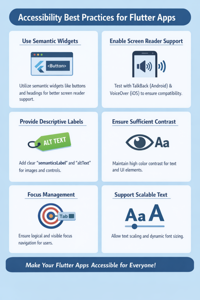
Accessibility ensures that everyone can use your app, including people with visual, motor, cognitive, or hearing impairments. Over one billion people worldwide live with some form of disability, representing approximately 15% of the global population. In mobile development, accessibility is not an optional enhancement but a core quality requirement that affects legal compliance, market reach, and user satisfaction. Flutter provides strong built-in tools for building accessible interfaces, but they must be used intentionally and consistently. In this comprehensive guide, you will learn practical accessibility best practices for Flutter apps, understand how the Semantics system works, and see detailed code examples for creating inclusive, user-friendly experiences that work with screen readers, keyboard navigation, and other assistive technologies.
Why Accessibility Matters in Flutter
Accessible apps reach more users and provide a better experience for everyone, including people in challenging situations like bright sunlight, noisy environments, or temporary injuries.
• Support users with disabilities – visual, motor, cognitive, hearing impairments
• Improve usability in challenging environments – bright light, one-handed use, while driving
• Increase overall app clarity – accessibility improvements benefit all users
• Meet legal and compliance requirements – ADA, WCAG, Section 508
• Reduce support and usability issues – clear interfaces have fewer errors
• Expand market reach – accessible apps serve larger user bases
• Improve app store ratings – accessibility is a quality indicator
As a result, accessibility should be part of your standard development workflow from day one, not an afterthought.
Understanding Accessibility in Flutter
Flutter accessibility is built around the Semantics system, which creates a semantic tree parallel to the widget tree. This semantic tree describes UI elements to assistive technologies like screen readers.
// Flutter creates two trees:
// 1. Widget Tree - what you see
// 2. Semantics Tree - what screen readers see

// Most built-in widgets automatically add semantics:
ElevatedButton(
  onPressed: () {},
  child: Text('Submit'),
);
// Automatically has: button role, 'Submit' label, tap action

// Custom widgets need explicit semantics:
GestureDetector(
  onTap: () {},
  child: Container(
    child: Icon(Icons.star),
  ),
);
// No semantics! Screen reader can't interact with this
Key accessibility concepts in Flutter:
• Screen readers rely on semantic labels and roles
• Navigation depends on focus order and traversal groups
• Visual contrast affects readability for low-vision users
• Gestures must have alternative interactions
• Text scaling respects user preferences
• Touch targets need minimum sizes for motor accessibility
Using the Semantics Widget
The Semantics widget adds descriptive information for screen readers and other assistive technologies.
// Basic Semantics usage
Semantics(
  label: 'Submit registration form',
  button: true,
  enabled: true,
  child: ElevatedButton(
    onPressed: _submitForm,
    child: const Text('Submit'),
  ),
);

// Semantics with more properties
Semantics(
  label: 'Profile picture of John Doe',
  image: true,
  child: CircleAvatar(
    backgroundImage: NetworkImage(user.avatarUrl),
  ),
);

// Container semantics for grouping
Semantics(
  container: true,
  label: 'Shopping cart item',
  child: Card(
    child: ListTile(
      leading: Image.network(product.imageUrl),
      title: Text(product.name),
      subtitle: Text('\$${product.price}'),
      trailing: IconButton(
        icon: Icon(Icons.delete),
        onPressed: () => _removeItem(product),
        tooltip: 'Remove ${product.name} from cart',
      ),
    ),
  ),
);

// Excluding from semantics (decorative elements)
Semantics(
  excludeSemantics: true,
  child: DecorativeBackgroundPattern(),
);

// Or use ExcludeSemantics widget
ExcludeSemantics(
  child: DecorativeIcon(),
);
Semantics Properties Reference
Semantics(
  // Text description read by screen reader
  label: 'Description of element',

  // Additional hint for actions
  hint: 'Double tap to activate',

  // Current value (for sliders, progress, etc.)
  value: '50%',

  // Value increased description
  increasedValue: '60%',

  // Value decreased description
  decreasedValue: '40%',

  // Role indicators
  button: true,
  image: true,
  link: true,
  header: true,
  slider: true,
  textField: true,

  // State indicators
  enabled: true,
  checked: true,       // For checkboxes
  selected: true,      // For selections
  toggled: true,       // For switches
  focused: true,
  hidden: false,
  obscured: false,     // For passwords

  // Live region (announces changes)
  liveRegion: true,

  // Custom actions
  onTap: () {},
  onLongPress: () {},
  onScrollLeft: () {},
  onScrollRight: () {},
  onIncrease: () {},
  onDecrease: () {},

  child: Widget(),
);
Providing Accessible Labels
Icons, images, and custom widgets often need explicit labels because they have no inherent text content.
// Icons with tooltip (provides both visual and semantic label)
IconButton(
  icon: const Icon(Icons.delete),
  tooltip: 'Delete this item',
  onPressed: _deleteItem,
);

// Icon without button - needs Semantics
Semantics(
  label: 'Error indicator',
  child: Icon(Icons.error, color: Colors.red),
);

// Images with semantic labels
Image.network(
  product.imageUrl,
  semanticLabel: 'Photo of ${product.name}',
);

// Decorative images should be excluded
Image.asset(
  'assets/decorative_border.png',
  excludeFromSemantics: true,
);

// Complex custom widget example
class ProductCard extends StatelessWidget {
  final Product product;
  final VoidCallback onAddToCart;
  final VoidCallback onFavorite;

  const ProductCard({
    required this.product,
    required this.onAddToCart,
    required this.onFavorite,
  });

  @override
  Widget build(BuildContext context) {
    return Semantics(
      container: true,
      label: '${product.name}, \$${product.price}',
      child: Card(
        child: Column(
          children: [
            // Product image
            Image.network(
              product.imageUrl,
              semanticLabel: 'Image of ${product.name}',
            ),

            // Product info
            Padding(
              padding: EdgeInsets.all(8),
              child: Column(
                crossAxisAlignment: CrossAxisAlignment.start,
                children: [
                  Text(
                    product.name,
                    style: Theme.of(context).textTheme.titleMedium,
                  ),
                  Text('\$${product.price}'),
                ],
              ),
            ),

            // Action buttons
            Row(
              mainAxisAlignment: MainAxisAlignment.spaceEvenly,
              children: [
                IconButton(
                  icon: Icon(Icons.favorite_border),
                  tooltip: 'Add ${product.name} to favorites',
                  onPressed: onFavorite,
                ),
                IconButton(
                  icon: Icon(Icons.add_shopping_cart),
                  tooltip: 'Add ${product.name} to cart',
                  onPressed: onAddToCart,
                ),
              ],
            ),
          ],
        ),
      ),
    );
  }
}
Managing Focus and Navigation
Keyboard and assistive technology navigation require proper focus handling and logical traversal order.
// Use FocusTraversalGroup for logical grouping
class NavigableForm extends StatelessWidget {
  @override
  Widget build(BuildContext context) {
    return FocusTraversalGroup(
      policy: OrderedTraversalPolicy(),
      child: Column(
        children: [
          // Fields navigate in order
          FocusTraversalOrder(
            order: NumericFocusOrder(1),
            child: TextFormField(
              decoration: InputDecoration(labelText: 'First Name'),
            ),
          ),
          FocusTraversalOrder(
            order: NumericFocusOrder(2),
            child: TextFormField(
              decoration: InputDecoration(labelText: 'Last Name'),
            ),
          ),
          FocusTraversalOrder(
            order: NumericFocusOrder(3),
            child: TextFormField(
              decoration: InputDecoration(labelText: 'Email'),
            ),
          ),
          FocusTraversalOrder(
            order: NumericFocusOrder(4),
            child: ElevatedButton(
              onPressed: _submit,
              child: Text('Submit'),
            ),
          ),
        ],
      ),
    );
  }
}

// Custom focus handling
class FocusableCard extends StatefulWidget {
  @override
  _FocusableCardState createState() => _FocusableCardState();
}

class _FocusableCardState extends State {
  final FocusNode _focusNode = FocusNode();
  bool _isFocused = false;

  @override
  void dispose() {
    _focusNode.dispose();
    super.dispose();
  }

  @override
  Widget build(BuildContext context) {
    return Focus(
      focusNode: _focusNode,
      onFocusChange: (focused) {
        setState(() => _isFocused = focused);
      },
      child: GestureDetector(
        onTap: () {
          _focusNode.requestFocus();
          _handleTap();
        },
        child: AnimatedContainer(
          duration: Duration(milliseconds: 200),
          decoration: BoxDecoration(
            border: Border.all(
              color: _isFocused ? Colors.blue : Colors.transparent,
              width: 2,
            ),
          ),
          child: CardContent(),
        ),
      ),
    );
  }
}

// Skip to main content link (for keyboard users)
class SkipToContentLink extends StatelessWidget {
  final FocusNode mainContentFocusNode;

  const SkipToContentLink({required this.mainContentFocusNode});

  @override
  Widget build(BuildContext context) {
    return Semantics(
      link: true,
      label: 'Skip to main content',
      child: InkWell(
        onTap: () => mainContentFocusNode.requestFocus(),
        child: Padding(
          padding: EdgeInsets.all(8),
          child: Text('Skip to main content'),
        ),
      ),
    );
  }
}
Supporting Screen Readers
Flutter integrates with TalkBack (Android) and VoiceOver (iOS). Use announcements and live regions to communicate dynamic changes.
// Announce important changes
void _onFormSubmitted() {
  // Process form...

  // Announce success to screen reader
  SemanticsService.announce(
    'Form submitted successfully. You will receive a confirmation email.',
    TextDirection.ltr,
  );
}

void _onError(String errorMessage) {
  SemanticsService.announce(
    'Error: $errorMessage',
    TextDirection.ltr,
  );
}

// Live regions for dynamic content
class NotificationBanner extends StatelessWidget {
  final String message;

  const NotificationBanner({required this.message});

  @override
  Widget build(BuildContext context) {
    return Semantics(
      liveRegion: true,  // Announces changes automatically
      label: message,
      child: Container(
        padding: EdgeInsets.all(16),
        color: Colors.blue,
        child: Text(
          message,
          style: TextStyle(color: Colors.white),
        ),
      ),
    );
  }
}

// Loading state announcements
class LoadingIndicator extends StatelessWidget {
  final bool isLoading;

  const LoadingIndicator({required this.isLoading});

  @override
  Widget build(BuildContext context) {
    if (!isLoading) return SizedBox.shrink();

    return Semantics(
      label: 'Loading, please wait',
      child: CircularProgressIndicator(),
    );
  }
}

// Progress updates
class UploadProgress extends StatelessWidget {
  final double progress;

  const UploadProgress({required this.progress});

  @override
  Widget build(BuildContext context) {
    final percentage = (progress * 100).round();

    return Semantics(
      label: 'Upload progress',
      value: '$percentage%',
      child: Column(
        children: [
          LinearProgressIndicator(value: progress),
          Text('$percentage% complete'),
        ],
      ),
    );
  }
}
Text Scaling and Font Size
Users may increase system font size for readability. Your app should respect these preferences and handle text scaling gracefully.
// Use TextTheme instead of fixed sizes
class AccessibleText extends StatelessWidget {
  @override
  Widget build(BuildContext context) {
    final textTheme = Theme.of(context).textTheme;

    return Column(
      crossAxisAlignment: CrossAxisAlignment.start,
      children: [
        // ✅ Good - respects text scaling
        Text(
          'Settings',
          style: textTheme.headlineMedium,
        ),
        Text(
          'Configure your preferences',
          style: textTheme.bodyLarge,
        ),

        // ❌ Bad - fixed font size ignores user preferences
        Text(
          'Fixed size text',
          style: TextStyle(fontSize: 14), // Doesn't scale!
        ),
      ],
    );
  }
}

// Handle text overflow gracefully
class AdaptiveText extends StatelessWidget {
  final String text;

  const AdaptiveText(this.text);

  @override
  Widget build(BuildContext context) {
    return Text(
      text,
      maxLines: 2,
      overflow: TextOverflow.ellipsis,
      // Or use FittedBox for scaling down
    );
  }
}

// Test with different scale factors
class ScaleTestWrapper extends StatelessWidget {
  final Widget child;
  final double scaleFactor;

  const ScaleTestWrapper({
    required this.child,
    this.scaleFactor = 2.0,
  });

  @override
  Widget build(BuildContext context) {
    return MediaQuery(
      data: MediaQuery.of(context).copyWith(
        textScaler: TextScaler.linear(scaleFactor),
      ),
      child: child,
    );
  }
}

// Limit maximum text scaling if needed (use sparingly)
class LimitedScaleText extends StatelessWidget {
  final String text;

  const LimitedScaleText(this.text);

  @override
  Widget build(BuildContext context) {
    final mediaQuery = MediaQuery.of(context);
    final limitedScaler = mediaQuery.textScaler.clamp(
      minScaleFactor: 0.8,
      maxScaleFactor: 1.5,
    );

    return MediaQuery(
      data: mediaQuery.copyWith(textScaler: limitedScaler),
      child: Text(text),
    );
  }
}
Color Contrast and Visual Clarity
Low contrast makes content difficult or impossible to read for users with visual impairments. WCAG requires minimum contrast ratios.
// WCAG contrast requirements:
// - Normal text: 4.5:1 minimum (AA), 7:1 enhanced (AAA)
// - Large text (18pt+): 3:1 minimum (AA), 4.5:1 enhanced (AAA)
// - UI components: 3:1 minimum

// Define accessible color schemes
final accessibleTheme = ThemeData(
  colorScheme: ColorScheme.light(
    primary: Color(0xFF1565C0),      // Sufficient contrast on white
    onPrimary: Colors.white,
    secondary: Color(0xFF2E7D32),
    onSecondary: Colors.white,
    error: Color(0xFFC62828),        // Accessible red
    onError: Colors.white,
    surface: Colors.white,
    onSurface: Color(0xFF212121),    // Near-black for text
  ),
);

// Never rely on color alone - combine with icons and text
class AccessibleStatus extends StatelessWidget {
  final String status;

  const AccessibleStatus({required this.status});

  @override
  Widget build(BuildContext context) {
    // ❌ Bad - color only
    // return Container(
    //   color: status == 'error' ? Colors.red : Colors.green,
    // );

    // ✅ Good - color + icon + text
    final isError = status == 'error';

    return Row(
      children: [
        Icon(
          isError ? Icons.error : Icons.check_circle,
          color: isError ? Colors.red : Colors.green,
          semanticLabel: isError ? 'Error' : 'Success',
        ),
        SizedBox(width: 8),
        Text(
          isError ? 'An error occurred' : 'Operation successful',
          style: TextStyle(
            color: isError ? Colors.red.shade900 : Colors.green.shade900,
          ),
        ),
      ],
    );
  }
}

// High contrast mode support
class AdaptiveColorWidget extends StatelessWidget {
  @override
  Widget build(BuildContext context) {
    final highContrast = MediaQuery.of(context).highContrast;

    return Container(
      decoration: BoxDecoration(
        border: Border.all(
          color: highContrast ? Colors.black : Colors.grey,
          width: highContrast ? 2 : 1,
        ),
      ),
      child: Text('Content'),
    );
  }
}
Supporting Touch Targets
Small touch areas are difficult for users with motor impairments. Material Design recommends minimum 48×48 logical pixels.
// Ensure minimum touch target size
class AccessibleIconButton extends StatelessWidget {
  final IconData icon;
  final String tooltip;
  final VoidCallback onPressed;

  const AccessibleIconButton({
    required this.icon,
    required this.tooltip,
    required this.onPressed,
  });

  @override
  Widget build(BuildContext context) {
    return Semantics(
      button: true,
      label: tooltip,
      child: InkWell(
        onTap: onPressed,
        customBorder: CircleBorder(),
        child: Padding(
          padding: EdgeInsets.all(12), // Total 48x48 with 24px icon
          child: Icon(icon, size: 24),
        ),
      ),
    );
  }
}

// Minimum touch target wrapper
class MinimumTouchTarget extends StatelessWidget {
  final Widget child;
  final VoidCallback onTap;

  const MinimumTouchTarget({
    required this.child,
    required this.onTap,
  });

  @override
  Widget build(BuildContext context) {
    return ConstrainedBox(
      constraints: BoxConstraints(
        minWidth: 48,
        minHeight: 48,
      ),
      child: InkWell(
        onTap: onTap,
        child: Center(child: child),
      ),
    );
  }
}

// Spacing between touch targets
class AccessibleButtonRow extends StatelessWidget {
  @override
  Widget build(BuildContext context) {
    return Row(
      children: [
        ElevatedButton(
          onPressed: () {},
          child: Text('Cancel'),
        ),
        SizedBox(width: 16), // Minimum 8dp between targets
        ElevatedButton(
          onPressed: () {},
          child: Text('Submit'),
        ),
      ],
    );
  }
}
Handling Gestures Accessibly
Complex gestures like swipes, long presses, and multi-touch should always have accessible alternatives.
// Swipe action with accessible alternative
class AccessibleDismissible extends StatelessWidget {
  final Widget child;
  final VoidCallback onDelete;

  const AccessibleDismissible({
    required this.child,
    required this.onDelete,
  });

  @override
  Widget build(BuildContext context) {
    return Dismissible(
      key: UniqueKey(),
      direction: DismissDirection.endToStart,
      onDismissed: (_) => onDelete(),
      background: Container(
        color: Colors.red,
        alignment: Alignment.centerRight,
        padding: EdgeInsets.only(right: 16),
        child: Icon(Icons.delete, color: Colors.white),
      ),
      child: Semantics(
        customSemanticsActions: {
          // Provide alternative action for screen readers
          CustomSemanticsAction(label: 'Delete'): onDelete,
        },
        child: child,
      ),
    );
  }
}

// Long press action with alternatives
class AccessibleLongPress extends StatelessWidget {
  final Widget child;
  final VoidCallback onTap;
  final VoidCallback onLongPress;

  const AccessibleLongPress({
    required this.child,
    required this.onTap,
    required this.onLongPress,
  });

  @override
  Widget build(BuildContext context) {
    return Semantics(
      onLongPress: onLongPress,
      customSemanticsActions: {
        CustomSemanticsAction(label: 'Show options'): onLongPress,
      },
      child: GestureDetector(
        onTap: onTap,
        onLongPress: onLongPress,
        child: child,
      ),
    );
  }
}

// Drag action with increase/decrease alternative
class AccessibleSlider extends StatelessWidget {
  final double value;
  final ValueChanged onChanged;

  const AccessibleSlider({
    required this.value,
    required this.onChanged,
  });

  @override
  Widget build(BuildContext context) {
    return Semantics(
      slider: true,
      value: '${(value * 100).round()}%',
      increasedValue: '${((value + 0.1).clamp(0, 1) * 100).round()}%',
      decreasedValue: '${((value - 0.1).clamp(0, 1) * 100).round()}%',
      onIncrease: () => onChanged((value + 0.1).clamp(0, 1)),
      onDecrease: () => onChanged((value - 0.1).clamp(0, 1)),
      child: Slider(
        value: value,
        onChanged: onChanged,
      ),
    );
  }
}
Accessibility for Forms and Inputs
Forms require extra care to ensure labels, errors, and validation are accessible.
class AccessibleForm extends StatefulWidget {
  @override
  _AccessibleFormState createState() => _AccessibleFormState();
}

class _AccessibleFormState extends State {
  final _formKey = GlobalKey();
  final _emailController = TextEditingController();
  final _passwordController = TextEditingController();
  String? _emailError;
  String? _passwordError;

  @override
  Widget build(BuildContext context) {
    return Form(
      key: _formKey,
      child: Column(
        children: [
          // Email field with accessible error handling
          Semantics(
            textField: true,
            label: 'Email address',
            hint: _emailError ?? 'Enter your email',
            child: TextFormField(
              controller: _emailController,
              decoration: InputDecoration(
                labelText: 'Email address',
                hintText: 'name@example.com',
                errorText: _emailError,
                // Error announced by screen reader
                errorStyle: TextStyle(color: Colors.red.shade700),
              ),
              keyboardType: TextInputType.emailAddress,
              autocorrect: false,
              textInputAction: TextInputAction.next,
              validator: (value) {
                if (value == null || !value.contains('@')) {
                  return 'Please enter a valid email address';
                }
                return null;
              },
              onChanged: (_) {
                if (_emailError != null) {
                  setState(() => _emailError = null);
                }
              },
            ),
          ),

          SizedBox(height: 16),

          // Password field
          Semantics(
            textField: true,
            label: 'Password',
            hint: _passwordError ?? 'Enter your password',
            obscured: true,
            child: TextFormField(
              controller: _passwordController,
              decoration: InputDecoration(
                labelText: 'Password',
                errorText: _passwordError,
                helperText: 'Minimum 8 characters',
              ),
              obscureText: true,
              textInputAction: TextInputAction.done,
              validator: (value) {
                if (value == null || value.length < 8) {
                  return 'Password must be at least 8 characters';
                }
                return null;
              },
            ),
          ),

          SizedBox(height: 24),

          // Submit button
          SizedBox(
            width: double.infinity,
            child: ElevatedButton(
              onPressed: _submit,
              child: Text('Sign In'),
            ),
          ),
        ],
      ),
    );
  }

  void _submit() {
    if (_formKey.currentState!.validate()) {
      // Process form
      SemanticsService.announce(
        'Signing in, please wait',
        TextDirection.ltr,
      );
    } else {
      // Announce validation errors
      SemanticsService.announce(
        'Please fix the errors in the form',
        TextDirection.ltr,
      );
    }
  }
}
Testing Accessibility in Flutter
Testing helps catch accessibility issues early. Use a combination of automated tests, manual testing, and real device testing.
// Widget test with semantics verification
import 'package:flutter_test/flutter_test.dart';

void main() {
  testWidgets('Button has correct semantics', (tester) async {
    await tester.pumpWidget(
      MaterialApp(
        home: IconButton(
          icon: Icon(Icons.delete),
          tooltip: 'Delete item',
          onPressed: () {},
        ),
      ),
    );

    // Verify semantics label exists
    expect(
      find.bySemanticsLabel('Delete item'),
      findsOneWidget,
    );
  });

  testWidgets('Form fields have labels', (tester) async {
    await tester.pumpWidget(
      MaterialApp(
        home: Scaffold(
          body: TextFormField(
            decoration: InputDecoration(labelText: 'Email'),
          ),
        ),
      ),
    );

    final semantics = tester.getSemantics(find.byType(TextFormField));
    expect(semantics.label, contains('Email'));
  });

  testWidgets('Minimum touch target size', (tester) async {
    await tester.pumpWidget(
      MaterialApp(
        home: IconButton(
          icon: Icon(Icons.add),
          onPressed: () {},
        ),
      ),
    );

    final size = tester.getSize(find.byType(IconButton));
    expect(size.width, greaterThanOrEqualTo(48));
    expect(size.height, greaterThanOrEqualTo(48));
  });
}

// Enable accessibility debugging in development
void main() {
  // Show semantics overlay for debugging
  debugShowCheckedModeBanner = false;

  runApp(
    MaterialApp(
      showSemanticsDebugger: true, // Enable to see semantics tree
      home: MyApp(),
    ),
  );
}
Manual Testing Checklist
• Enable TalkBack (Android) or VoiceOver (iOS) and navigate the entire app
• Test with keyboard navigation on web/desktop
• Increase text size to maximum in device settings
• Enable high contrast mode
• Test with color blindness simulation tools
• Verify all interactive elements have focus indicators
• Check that dynamic content changes are announced
Common Mistakes to Avoid
Avoid these common accessibility pitfalls that make apps unusable for assistive technology users.
1. Missing Semantics on Custom Widgets
// ❌ Bad - GestureDetector without semantics
GestureDetector(
  onTap: () => _selectItem(),
  child: Container(
    child: Text('Select'),
  ),
);

// ✅ Good - Semantics wrapping custom interaction
Semantics(
  button: true,
  label: 'Select item',
  child: GestureDetector(
    onTap: () => _selectItem(),
    child: Container(
      child: Text('Select'),
    ),
  ),
);
2. Relying Only on Color
// ❌ Bad - Color is the only indicator
Container(
  color: isValid ? Colors.green : Colors.red,
  child: Text('Status'),
);

// ✅ Good - Color + icon + text
Row(
  children: [
    Icon(
      isValid ? Icons.check : Icons.close,
      color: isValid ? Colors.green : Colors.red,
    ),
    Text(isValid ? 'Valid' : 'Invalid'),
  ],
);
3. Images Without Descriptions
// ❌ Bad - No semantic information
Image.network(url);

// ✅ Good - Meaningful semantic label
Image.network(
  url,
  semanticLabel: 'Product photo: Blue running shoes',
);

// ✅ Or exclude decorative images
Image.asset(
  'assets/decoration.png',
  excludeFromSemantics: true,
);
4. Hard-Coded Font Sizes
// ❌ Bad - Ignores user text scaling preferences
Text('Title', style: TextStyle(fontSize: 16));

// ✅ Good - Uses theme that respects scaling
Text('Title', style: Theme.of(context).textTheme.titleMedium);
Conclusion
Accessibility best practices in Flutter help you build apps that are inclusive, usable, and future-proof. By using semantics correctly, supporting screen readers with proper labels and announcements, respecting text scaling preferences, ensuring sufficient color contrast, and designing clear interactions with adequate touch targets, you create experiences that work for everyone regardless of ability.
Remember that accessibility is not a feature to add at the end but a quality characteristic to build in from the start. The patterns and widgets shown in this guide should become second nature in your Flutter development workflow.
If you are building global-ready apps, read Internationalisation & Localisation (i18n/l10n) in Flutter. For advanced UI motion that respects reduced motion preferences, see Custom Animations with AnimationController & Tween. You can also explore the Flutter accessibility documentation, the Material accessibility guidelines, and the WCAG 2.1 quick reference. With accessibility built in from the start, Flutter apps become more usable, resilient, and impactful for all users.